UPDATE: I found a major problem with the below simulations, which I have fixed in a follow up post. Please DO NOT use the graphs or settings advice below. Instead see the follow up post.
(If you're already familiar with all this background and just want to see the results, skip down to the Results section.)
Something I haven't talked about on this blog yet is that I'm learning Japanese.
One of the tools that many people use to aid in learning a new language is an application called Anki. It's a flashcard application with automated review scheduling based on spaced repetition. You can make flash cards in Anki for just about anything, but in the context of language learning it's really useful for moving vocabulary, grammar, etc. into your long-term memory. As I understand it, it shouldn't be your primary study method, but it can accelerate your language learning when used as a supplement to e.g. immersion/input-based approaches.
One of the resources I've found useful in figuring out how to even approach learning Japanese has been the YouTube channel Matt vs Japan, and he recently posted a video suggesting a different approach to configuring Anki's spaced repetition settings.
Traditionally, you try to maximize your retention rates (i.e. minimize forgotten cards), balanced with how much time you're willing to spend studying. But in this video Matt presents a remarkable insight: what matters isn't your retention rate, what matters is how many total cards you memorize per unit of time you spend studying. And it turns out, you can memorize more total cards if you're also willing to forget more cards (up to a point) by making your intervals larger.
Matt took a crack at calculating what those optimal intervals would be. It depends on a variety of factors, so he came up with a formula that people can use to determine their own optimal intervals. However, in the video he also encouraged people to not take it on faith, and instead make sure the math actually works themselves. He is (like all of us) human, after all.
So I decided to take a different approach to solving the same problem: simulation. Partly this is to verify Matt's work, and partly this is because we can take more variables into account with simulation, and potentially get more accurate optimal intervals.
Results
The code for the simulation can be found on my github. I haven't put a license on the repo yet, but please consider it as public domain. I encourage anyone who wants to to mess around with it or build on it to do so. It's written in Rust, so it should be pretty painless to build and run for anyone with basic command line experience.
My simulation makes most of the same assumptions as in Matt's video, so if the base assumptions are wrong, my simulation is wrong as well. So take this with a certain amount of salt.
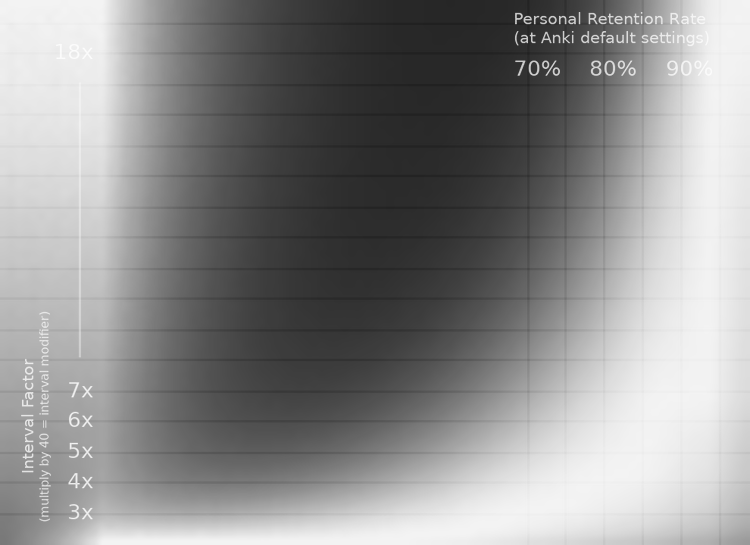
The fun part of my simulation is that it produces visualizations. For example, this:
The vertical axis is the card's interval factor, and the horizontal axis is the user's retention rate with default Anki settings. The brightness of the pixels represents how many cards you memorize per hour of study: brighter is more, darker is fewer.
(A side-note about "Interval Factor": this is literally the number that your card's interval is multiplied by when you answer "good" on a card. I find this easier to reason about during simulation. Getting the Interval Modifier setting—which Matt talked in terms of—from this number is easy: just multiply by 40. For example, an Interval Factor of 7.5x = 7.5 * 40 = Interval Modifier 300%. This assumes that you leave your new card ease at 250%, as is default in Anki.)
One of the things that is immediately obvious is that having better personal retention is... better. Which shouldn't be surprising. As you get closer and closer to 100% retention, the interval factor matters less and less, and you can crank it up crazy high. In other words, if you never forget anything, you never have to review! So it is completely unsurprising that the brightest pixels in the chart are in the upper-right corner: having 100% retention is super time-efficient!
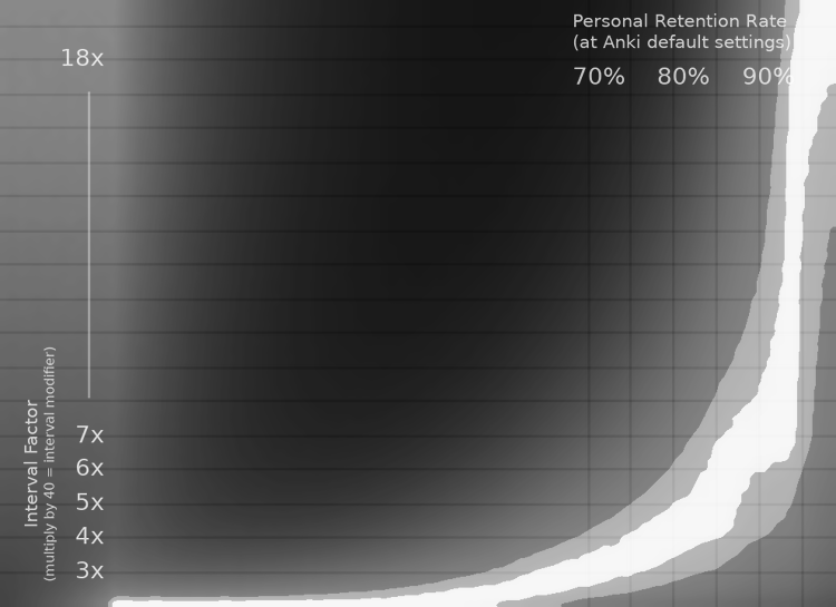
Of course, no human has 100% memory retention (that I'm aware of). And, in fact, for any given person, the only thing that matters in this graph is the vertical slice of pixels corresponding to their personal retention rate. So I have a modified chart that helps us visualize that:
This is the same graph as before, except that each vertical slice of pixels has been individually normalized so that its own brightest pixel is white. In other words, the white pixels show the curve of optimal interval factors. (Note: the right-most part of the image has a strange discontinuity—this is because the optimal factor goes off the top of the chart.)
One of the hilarious things about this image is the left side: at some point, if you're really bad at memorizing things, super long intervals start to be optimal again. However, I'm pretty sure this is a weakness in the simulation, as its assumptions start to break down. It probably doesn't actually match reality. Nevertheless, I find it funny.
In any case, the most obvious thing about this image is that the optimal intervals curve upwards as the personal retention rate increases. This, again, makes perfect sense given what we know: if you can hold cards in your memory longer, you don't need to review as often, so you can be more efficient with your time at longer intervals.
Another thing worth noting about this chart is that the falloff from white (optimal) is very smooth and gradual. This is important, because it means that the exact settings aren't delicate. You can be off by a decent bit and still be close to optimally efficient.
To drive that last point home even stronger, here is the last (and most useful) chart:
The white strip is the area where you are within 99% percent of optimal efficiency. The light gray strip outside of that is the area within 95% of optimal efficiency.
For example, if your personal retention rate at default Anki settings is 90%, then you can use an interval factor anywhere between 6x and 8x and still be 99% efficient. And if you're willing to go as low as 95% efficiency, you can range between 4x and 11.5x. That's a huge range.
However, keep in mind that this is all a bit fuzzy. There are many assumptions made in this simulation, and the sampling has a small bit of noise in it (which is why the strips aren't smooth curves). So aiming for the middle of the 99% efficiency strip is probably best if you have good data on your retention rate.
None of this is especially revolutionary, so far. Matt already figured most of this stuff out in his video. So this is mostly just validating his formula.
But what I find most interesting about this graph is what it means for people who are just starting out, and don't already have data on their retention rate. In other words: if you have no idea what your retention rate is, what interval factor should you use? This graph helps us answer that question.
Although I don't have any data to back this up, my guess is that most people fall somewhere in the 80-90% retention range, with maybe some outliers going as low as 75%. So if we look at the entire range between 75% and 90%, we can see that a 5x interval factor gives us 95%+ efficiency in the entire 80-90% range, and even at a 75% retention rate you barely squeeze in at 95% of optimal efficiency.
My guess at typical retention rates could be off, but I think it's at least a reasonable guess (if anyone has real data on this, I'd love to know!). So my suggestion is this: when starting out, use a 5x interval factor (or interval modifier of 200%, as per Matt's video). Then you're likely operating within 95% of optimal efficiency. Once you've been using Anki for several months, then you can take a look at your actual retention rate and adjust from there.
Do note, however, that the above graphs have personal retention rates corresponding to default anki settings. So here's another graph for retention rates using the 200% interval modifier:
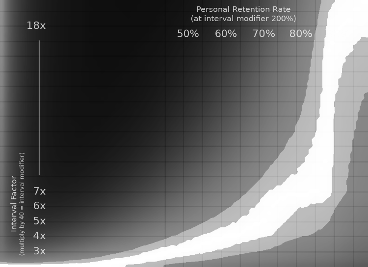
Once you've collected enough retention data using an interval modifier of 200%, use this graph to find your optimal setting. That is, if you care about squeezing out that last 5% of efficiency.
Final Notes
There's more I'd like to say on this topic, and I've glossed over quite a few things in this post. But it's already quite long, so I'm going to end it here. But I'll mention a couple final things.
First, tweaking the other settings of the simulation impact these graphs a bit. In particular, the "max lapses" setting can have a really significant impact. I set it to 8 lapses for the simulations in this post. In my testing, this closely matches most max lapse settings you might choose, except for very low ones (e.g. 3 or less). Aside from that, I've tried to use fairly "typical" settings for the graphs in this post, and therefore this should be pretty close to accurate for most configurations. But if your settings are especially atypical, I recommend re-running the simulations yourself with your own Anki settings.
Second, as Matt noted in his video, these ideas are untested in the real world. The assumptions and math used in these simulations might not match real human beings. Therefore, take this with an appropriate grain of salt. However, I do think the principle is sound, and I would be surprised if e.g. using an interval factor of 4x (interval modifier 160%) wouldn't be beneficial to efficiency, even if the assumptions break down at more extreme settings like the ones suggested in this post and by Matt in his video. In any case, I plan to use the 5x factor (200% modifier) myself, and see how it goes. If you're up for being a guinea pig, feel free to join me!